Showing posts with label paint. Show all posts

Forgotten // Solution 1


This is the first half of my A2 Art coursework project. After selecting the theme 'Lost and Found', I focused in on the forgotten/lost aspect. The brief I then developed was to create a piece of work that generated an atmosphere. 

After heavy research and analysis into Jane and Louise Wilson's work (photographed below in the RA Summer Exhibition) I chose to develop a piece that had an overwhelmingly eerie atmosphere.

The piece I created in reflection of Jane and Louise and my starting brief, was a series of layered pieces, featuring photoshopped overlaid images, cardboard expressive marks and cutouts on acetate. The pieces are framed with a rustic 'unfinished' wooden frame; the includes rusty nails, hooks and chains - the idea being to add to this abandoned and forgotten quality of the work. Presentation of the work will feature eerie noise, captured when I visited and photographed my local under passage /subway at night. 

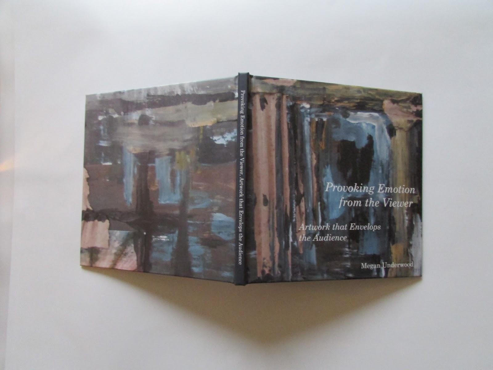
In the project I also presented an essay titled 'Provoking Emotion, Artwork that Envelops the Audience'.


0

Photographic Series

 
Developing my interest in photography, I completed a set of photographic series. Within these series I manipulated, layered and worked into my photographs.
 
The series featuring natural floral imagery, I experimented with tracing paper layers and cut outs in order to enhance particular areas and textures in the photographs. With left over 'cut outs',  I photographed the flowers through the circle 'gap' giving a blurred effect.
 
I created a series of photographic responses to the work of Eduardo Recife. Here I have used paints and stencils to layer and overlap the imagery. Typography has also been included in the outcomes. 
 
'Altering Reality' - a the trio of 'Oxford knitting' photographs. The Oxford knitting added a unique twist on the iconic surrounding in my local area, I was hugely excited to have come across this and have photographed and developed further by simplifying the Radcliffe Camera  and surrounding buildings.
 
 I also experimented with beach photography by working into the images with beach 'doodles' and quotations. In this silhouette image I added a stereotypical seaside quotation, the typography followed the direction of a wave. 


0

Exploring Type

 
The independent project was to enable me to explore typography further. Within this sketchbook, I explored different types of typography and fonts, several typographic designers and different techniques to create this type.
 
My favourite parts of the project were the paper cut photographic typography piece, the layered coloured design, the multi layered cut out and the handwriting project - where I collected a sample of peoples handwriting from my Sixth Form. It was interesting to observe how much extra care they took when writing when I asked them to; this concept was something I originally hadn't thought about.


0

Real Art Magazine

I decided to create an art and design magazine for my AS Media Studies coursework. Reaching out to a art/creative student demographic. The project focus was mainly on the front page and 'cover story'; for which I staged a photo shoot where I painted the face of my model (Photos Attached). Alongside the design elements I also wrote the articles. One being focused on creative subjects in school, this article also featured in my schools newsletter.


0

Reflections

 
'Reflections' - a photographic and painting project for my Fine Art AS level. I studied artists who's painting featured glass objects. From this I experimented with my own photography, placing glass objects on black and white backgrounds, lighting them with fairy lights. I found the results really interesting, particularly the photographs that were more cropped and close up of the glass and lights.
 
In a series of three I selected three images to paint using acrylic - the composition being that each image was more abstract and 'zoomed'.


0