Showing posts with label photography. Show all posts

#Handmade


Uni Semester One Magazine Project.

Brief: to create a magazine using one of the chosen '#' themes (I chose #Handmade) that reflected the skills you've learnt. Put together on InDesign, using skills from Illustrator, Photoshop and gum printing.


0

Sugar it is!


A2 Graphics coursework project. 

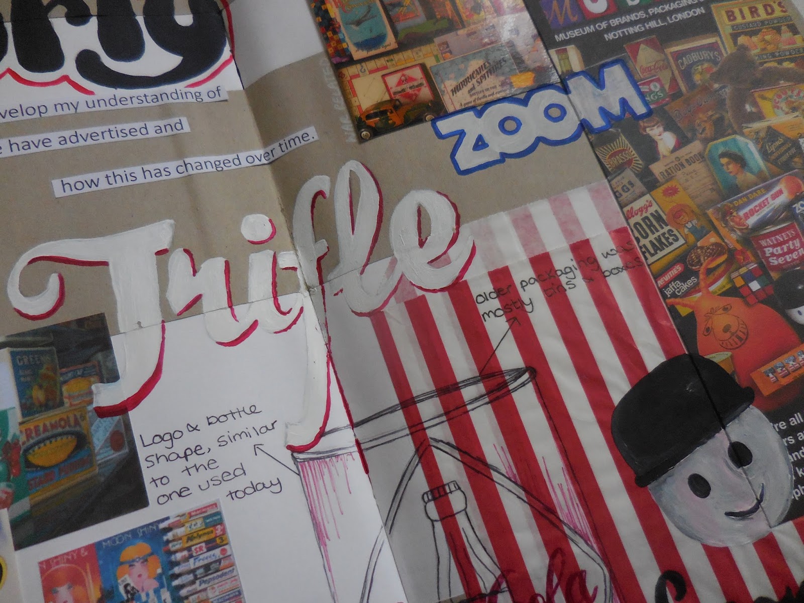
The idea behind this was to 'Make a Difference' in terms of health advertising and the particularly current issue of sugar tax. Initial experiments began with research into the development, adaptation and the morals behind advertising through time - most of this research focuses on the tobacco and cigarette industry. This was accompanied with a visit to the Brand and Packaging museum, London. This concept of the development of health advertising was used in a accompanying essay 'A comparative study into past and present advertising'; where I compared these past examples with modern campaigns such as Change4Life.

With high focus on Sugar Tax and Jamie Oliver's recent work to get this recognised. I developed a campaign that highlighted some of the important facts about sugary/ fizzy drinks. This was styled in a very graphics and gruesome way. In this project the graphics were created from an initial series of photoshoots - which I also had a go at creating this graphic cut and skin irritation - then transferred into Adobe Illustrator, where I self taught myself this illustrative block shape way of developing a face or object. To add to the brand/ campaign identity, I used the hazard symbolism to develop a logo and focusing on Coca Cola, a individual hazard symbol for each type of Coca Cola. In addition, I designed a landing page for the campaign which outlined the key aims. 


0

Mist Perfume

Alevel Media Coursework.

A series of sophisticated perfume adverts. The styling reflects on vintage perfume campaigns, such as Chanel.


0

Forgotten // Solution 1


This is the first half of my A2 Art coursework project. After selecting the theme 'Lost and Found', I focused in on the forgotten/lost aspect. The brief I then developed was to create a piece of work that generated an atmosphere. 

After heavy research and analysis into Jane and Louise Wilson's work (photographed below in the RA Summer Exhibition) I chose to develop a piece that had an overwhelmingly eerie atmosphere.

The piece I created in reflection of Jane and Louise and my starting brief, was a series of layered pieces, featuring photoshopped overlaid images, cardboard expressive marks and cutouts on acetate. The pieces are framed with a rustic 'unfinished' wooden frame; the includes rusty nails, hooks and chains - the idea being to add to this abandoned and forgotten quality of the work. Presentation of the work will feature eerie noise, captured when I visited and photographed my local under passage /subway at night. 

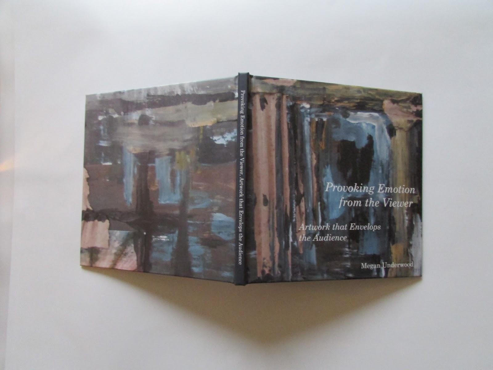
In the project I also presented an essay titled 'Provoking Emotion, Artwork that Envelops the Audience'.


0

Forgotten // Solution 2


This is the second solution to my A2 art coursework. Click HERE for full summary, from solution 1. 

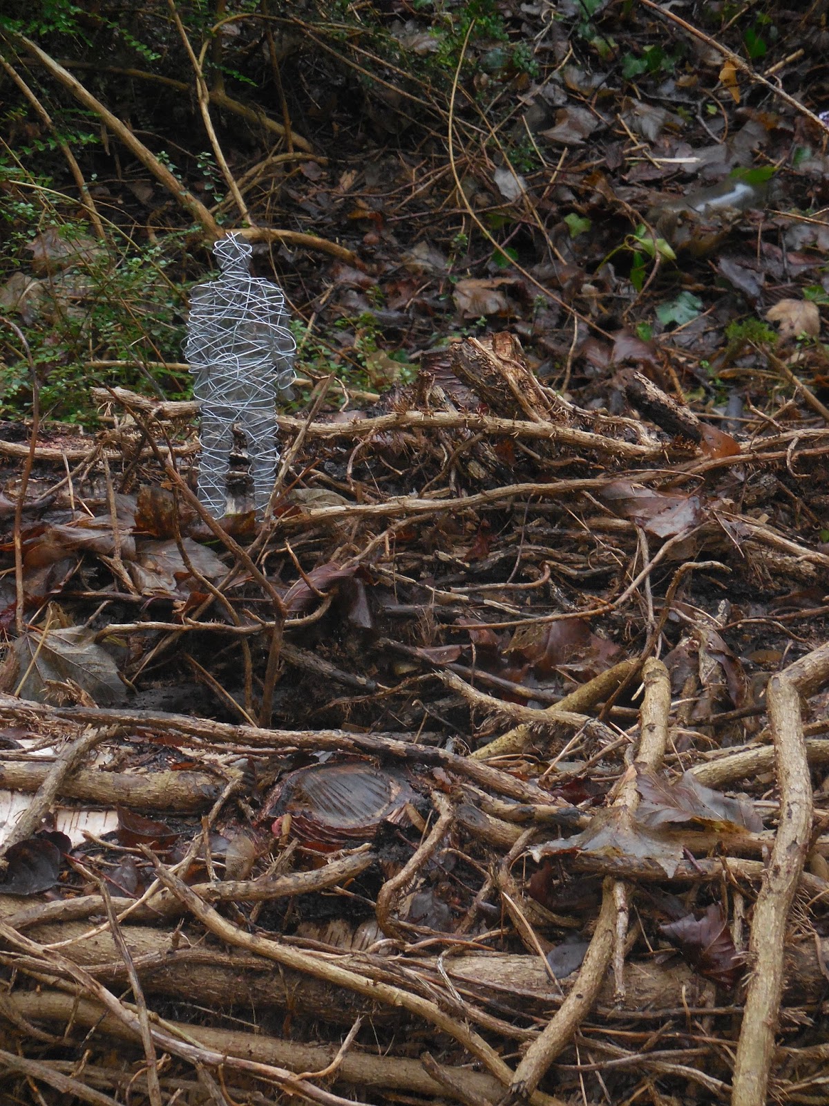
The second solution again aimed to achieve an eerie atmosphere, this time through the idea of 'Shadows' - when you walking alone, maybe through a wood, and it feels like someone is following you, that your not alone, yet you cannot see anyone. Artist inspiration from Gormley's figured, one located in my local city.

Achieved by using thick tracing paper with pen drawings of 'eerie' old looking trees, layered up with cutout sections and figured 'hiding'. Figures were later cut, generated on the 2D Design programme from photographs I had taken, onto a grey 'clear' acrylic plastic and wrapped with silver wire. This combination created interesting shadows.  


0

Photographic Series

 
Developing my interest in photography, I completed a set of photographic series. Within these series I manipulated, layered and worked into my photographs.
 
The series featuring natural floral imagery, I experimented with tracing paper layers and cut outs in order to enhance particular areas and textures in the photographs. With left over 'cut outs',  I photographed the flowers through the circle 'gap' giving a blurred effect.
 
I created a series of photographic responses to the work of Eduardo Recife. Here I have used paints and stencils to layer and overlap the imagery. Typography has also been included in the outcomes. 
 
'Altering Reality' - a the trio of 'Oxford knitting' photographs. The Oxford knitting added a unique twist on the iconic surrounding in my local area, I was hugely excited to have come across this and have photographed and developed further by simplifying the Radcliffe Camera  and surrounding buildings.
 
 I also experimented with beach photography by working into the images with beach 'doodles' and quotations. In this silhouette image I added a stereotypical seaside quotation, the typography followed the direction of a wave. 


0